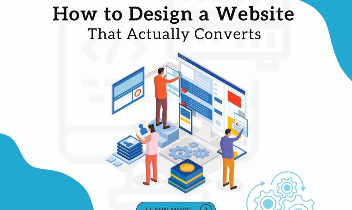
Most websites are simply static web pages that serve as branded placeholders for businesses. However, if you want your website to be a powerful tool for generating leads or converting traffic into customers, you must abandon the traditional approach to website design and focus on conversions.
Websites are typically used to establish a company as an authority in their field or to persuade a customer to take a specific action, such as making a purchase. The most successful websites maintain a high conversion rate while also displaying authority. In order for a company to gain authority, its website must raise customer awareness of the brand and position it as authentic and trustworthy.
Websites designed with authority in mind typically include elements such as logos, content, service pages, and information about the company’s history, vision, and goals. The website is used to foster trust and assist prospective customers in properly vetting the company during their search.
What Makes a Website Convert?
Understanding the basic foundational principles behind a high-converting website and actually executing are two different things. Here are some ways you can use tactical tips to get your website pointed in the right direction.
1. Use Custom Website Design- You have multiple options for designing a website. The quickest and least expensive option is to use one of those basic drag-and-drop website builders that are advertised everywhere. And, while these tools can assist you in creating a simple website,
they’re rarely optimized for conversions. They tend to produce websites more focused on building authority websites. You can put up some basic content, project a professional image, and include functions such as contact forms. Best wishes for creating a true high-converting website.
The second option is to buy a template and customize it to your specifications. Again, this is quick and inexpensive, but it limits your options. You must essentially fit your square peg into a round hole, which necessitates compromise.
The third option is to create a unique website. While it requires more planning and may cost more than using a “ready-made” option, custom website design is always superior. This enables you to collaborate with a website design team to build the entire site from the ground up. Many elements can be customized down to the pixel level.
2. Observe Hick’s Law- It states that the time it takes for someone to make a decision is directly related to the number of choices the person has. To put it more simply, more choices equals more time. And in the world of websites, more time means less conversions. When designing your website, do your best to limit the number of choices people have. Keeping your website focused should be the goal. More specifically, each page on your website should have just
one primary call-to-action.
3. Choose the Right Layout- The overall design of your website is critical. Researchers discovered that users browse websites in a “F” pattern using heat maps and eye-tracking software.
They usually begin at the top left of the screen, scan to the top right, and then work down the page’s left-hand column, occasionally glancing back to the right. Visualize a large “F” in your mind.
over any page to see where visitors are most likely to look.
4. Prioritize Site Speed- Few factors have as much of an impact on a website’s conversion rate as website speed. According to research, 47% of customers expect a page to load in two seconds or less. Those that take 2.4 seconds have a conversion rate of only 1.9%. And the figures only get worse from there. If a page takes 3.3 seconds to load, the average conversion rate is only 1.5%. It’s less than 1% by the time you get to 4.2 seconds. You should expect a 2% increase in conversions for every one second improvement in conversions. Your results, on the other hand, could be even more powerful. It’s not uncommon for websites to see a 5-7% increase in conversions after reducing page loading times by just a few seconds.
5. Reduce Opt-In Friction- Whether your goal is to get someone to fill out an opt-in form in exchange for a free lead magnet or to sell a physical product on an e-commerce page, minimizing friction at the point of opt-in is critical. The best way to accomplish this is to limit the number of fields required to complete the action.


![Great bikes deserve the right visibilityAt AimGlobal, we help two wheeler and automobile brands turn digital presence into real showroom visits test rides and salesFrom high performing social media to targeted ad campaigns, we focus on reaching the right audience and generating quality leads that convertTrusted by leading brands like Yamaha, TVS, Hyundai and Honda we bring strategy execution and results togetherBecause clicks should lead to customersWant more showroom visits and test ride bookings
DM us or visit www.aimglobal.digital[automobile marketing, two wheeler marketing, auto lead generation, showroom marketing, digital marketing for automobile, social media for auto brands, paid ads, performance marketing, test ride leads, car and bike marketing]](https://aimglobal.digital/wp-content/plugins/instagram-feed/img/placeholder.png)


